

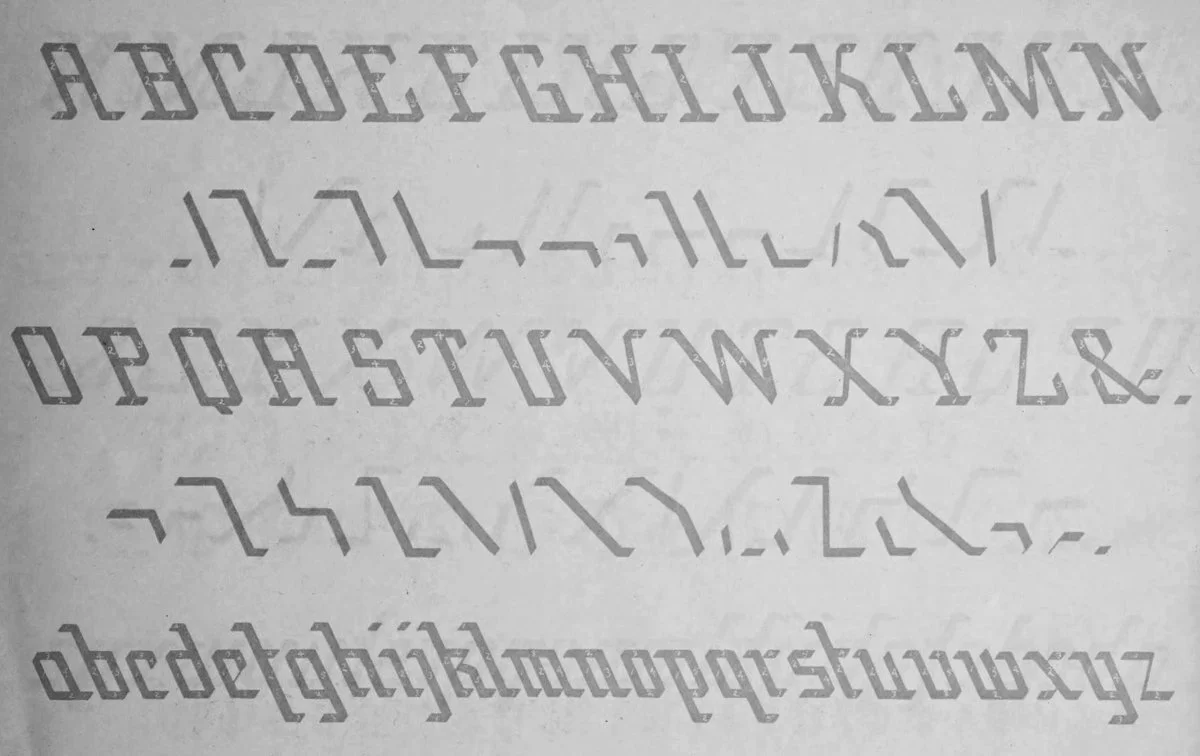
The ANFCo Stoakes typeface is based on the lettering of J.W. Stoakes, found in the lettering book of the J.W. Stoakes Automatic Shading Pen Company. It is a rather straight-lined, blackface-esque script that finds its distinction in its leftward lean. From the original exemplar, I have made a few slight adjustments to make certain characters more pleasing to the modern eye and easier for the casual viewer to read, while still preserving the original form quite faithfully.
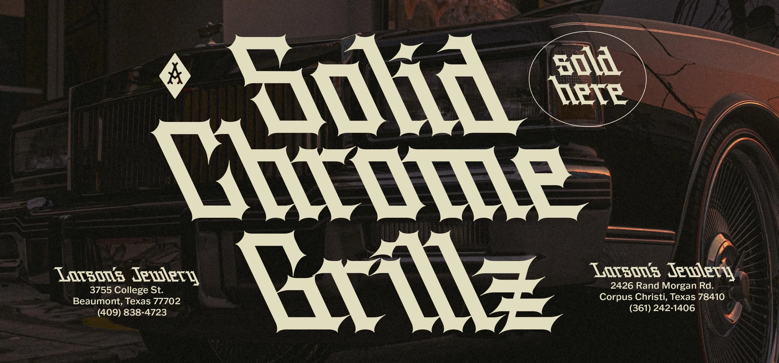
I have expanded the typeface to include several weights, and then further developed the style to include a “worn” version, intended to mimic weathered lettering, as well as a “sharp” version, which builds upon the gothic influences of the original script and creates something far more imposing from what was initially quite a simple writing style.
Due to its unconventional form, Stoakes is probably best used as a display typeface, though adventurous designers are encouraged to explore it in other contexts. I personally find that its simplicity makes it a great base form from which to build additional embellishments. Descenders and ascenders can be lengthened sideways to underline (or overline) text. Its geometric form and uniform angles also allow it to be stacked easily to create nicely shaded compositions — in fact, this was part of the original design concept presented in the Automatic Shading Pen manual.

Stoakes, J. W. How to Use the Automatic Shading Pen. [Milan, Ohio, J. W. Stoakes, 1891] Pdf. https://www.loc.gov/item/11026590/.